


SoFar Sounds Poster Design: 03.02
In my normal day to day, I create ideas and designs for ecommerce companies, which means strict rules and guidelines for what the output should be. When I get around to creating poster designs for SoFar Sounds, I treat them like an abstract piece of art.
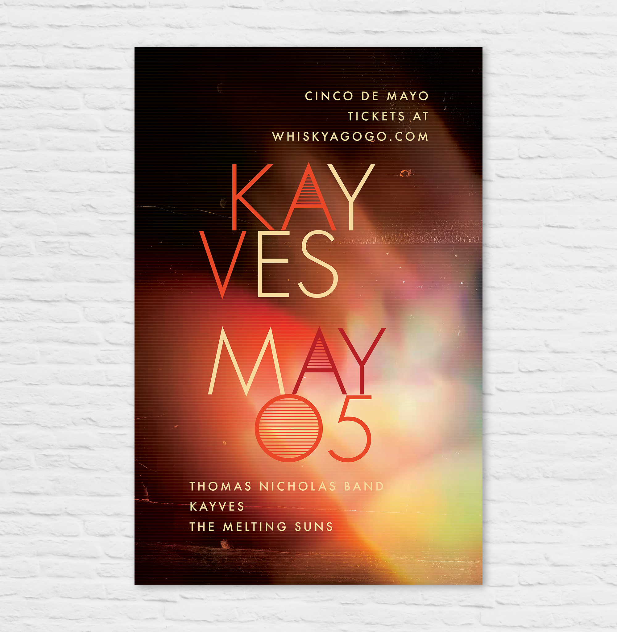
Poster Design: Kayves
Kayves musical influences include Joy Division, Foals, Interpol, The Cure, and Tame Impala. The band is working on an EP to keep the momentum going after a promising start at Coachella.

SoFar Sounds Poster Design: 10.28
Poster design for SoFar Sounds show in Culver City. Inspired by desert colors, and blended with random geometric shapes. Enjoy!

SoFar Sounds Poster Design: 09.27
I designed this poster for a SoFar Sounds music show taking place in Santa Monica, CA. When I started the design, I wanted to do a play on the letters in SoFar Sounds to create the abbreviation "SAMO" within, short for Santa Monica.

thredUP May Campaign
In April, I collaborated with the design team on Art Direction for thredUP's May Campaign. This involved helping develop the campaign visual design, photo shoot, and designing the key shareable assets.
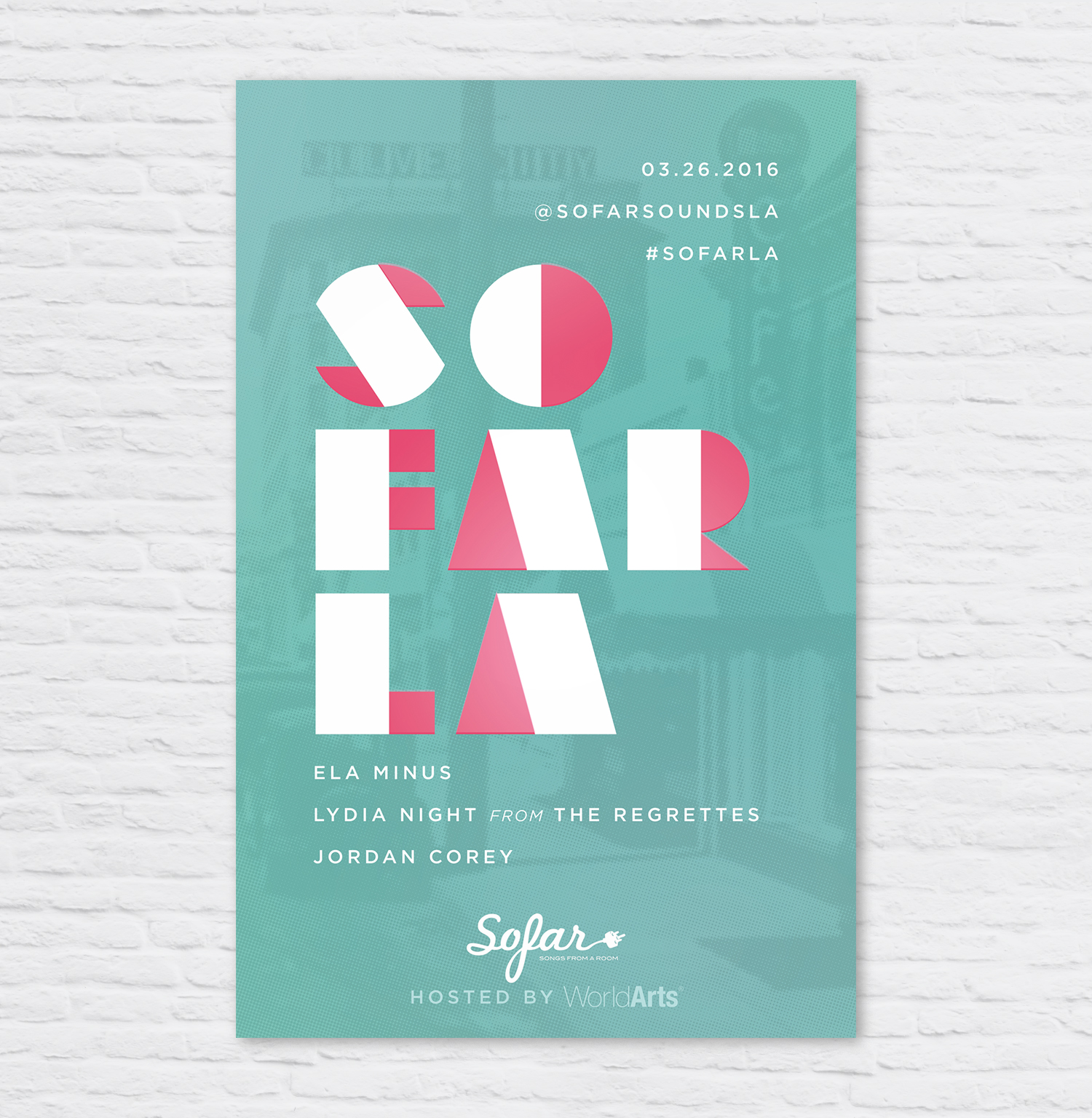
SoFar Sounds Poster Design: 03.26
I designed this poster for a SoFar Sounds show taking place in Culver City. I used a vintage image of Culver City, added a color halftone effect and overlaid it onto a seafoam green color.

SoFar Sounds Poster Design: 02.27
I designed this poster for a SoFar Sounds show taking place in Culver City. I used an image of a sunset that I took and overlaid it onto a red and purple gradient to give it a moody effect. I used the typeface DecoNeue Light and tweaked in in Illustrator to give it some more character.

SoFar Sounds Poster Design: 01.28
I designed this poster for SoFar Sounds L.A.'s January 28 show. I found this great trendy typeface called Hill House Medium. I love the double bars of the and dots below the O's.