

SoFar Sounds Poster Design: 09.27
I designed this poster for a SoFar Sounds music show taking place in Santa Monica, CA. When I started the design, I wanted to do a play on the letters in SoFar Sounds to create the abbreviation "SAMO" within, short for Santa Monica.

SoFar Sounds Poster Design: 08.25
I keep a Pinterest board called "harmonious hues" to keep a log of interesting color combos I'm drawn to. This helps when I'm designing to have some ideas to grab from.

thredUP May Campaign
In April, I collaborated with the design team on Art Direction for thredUP's May Campaign. This involved helping develop the campaign visual design, photo shoot, and designing the key shareable assets.
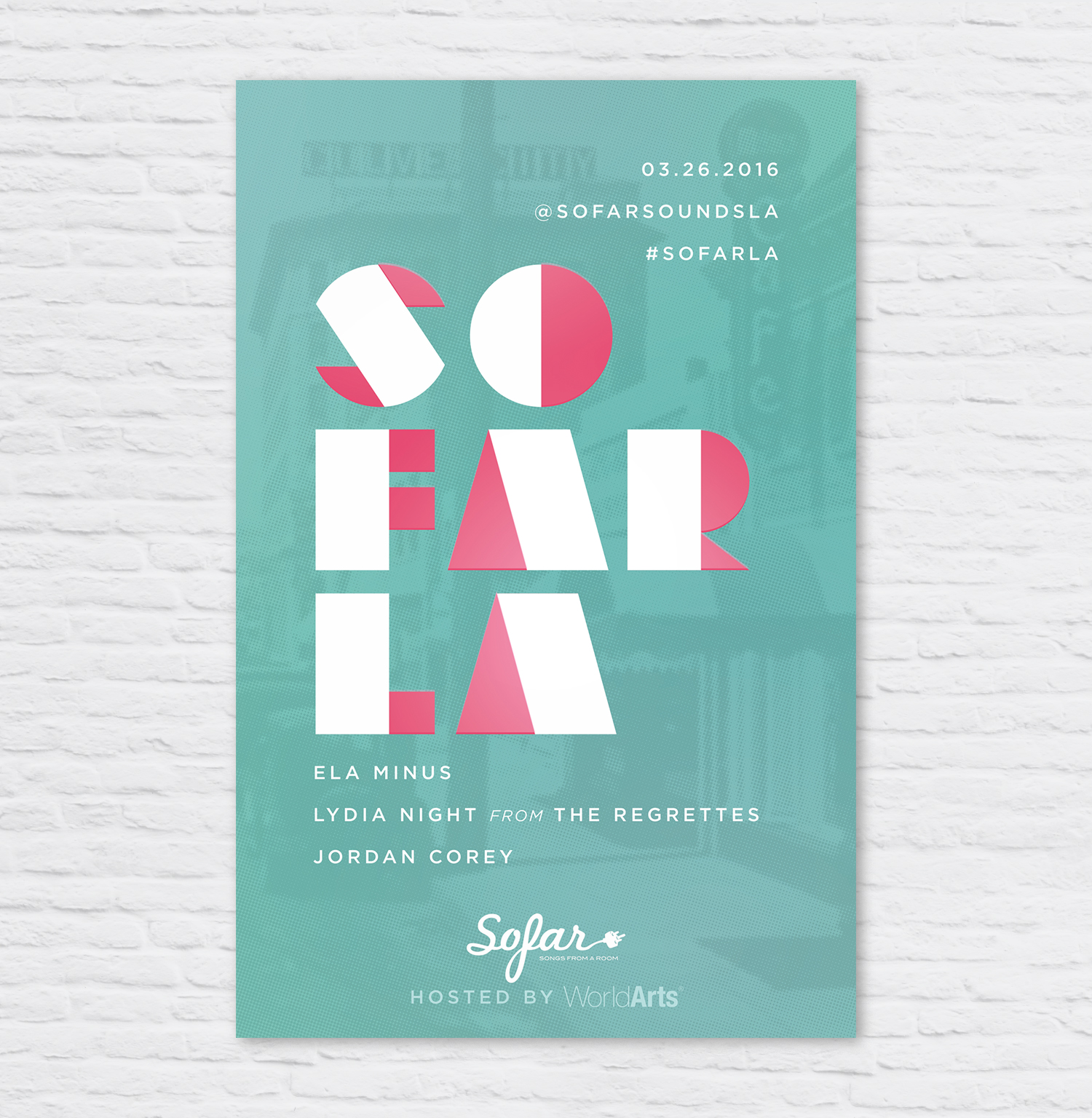
SoFar Sounds Poster Design: 03.26
I designed this poster for a SoFar Sounds show taking place in Culver City. I used a vintage image of Culver City, added a color halftone effect and overlaid it onto a seafoam green color.
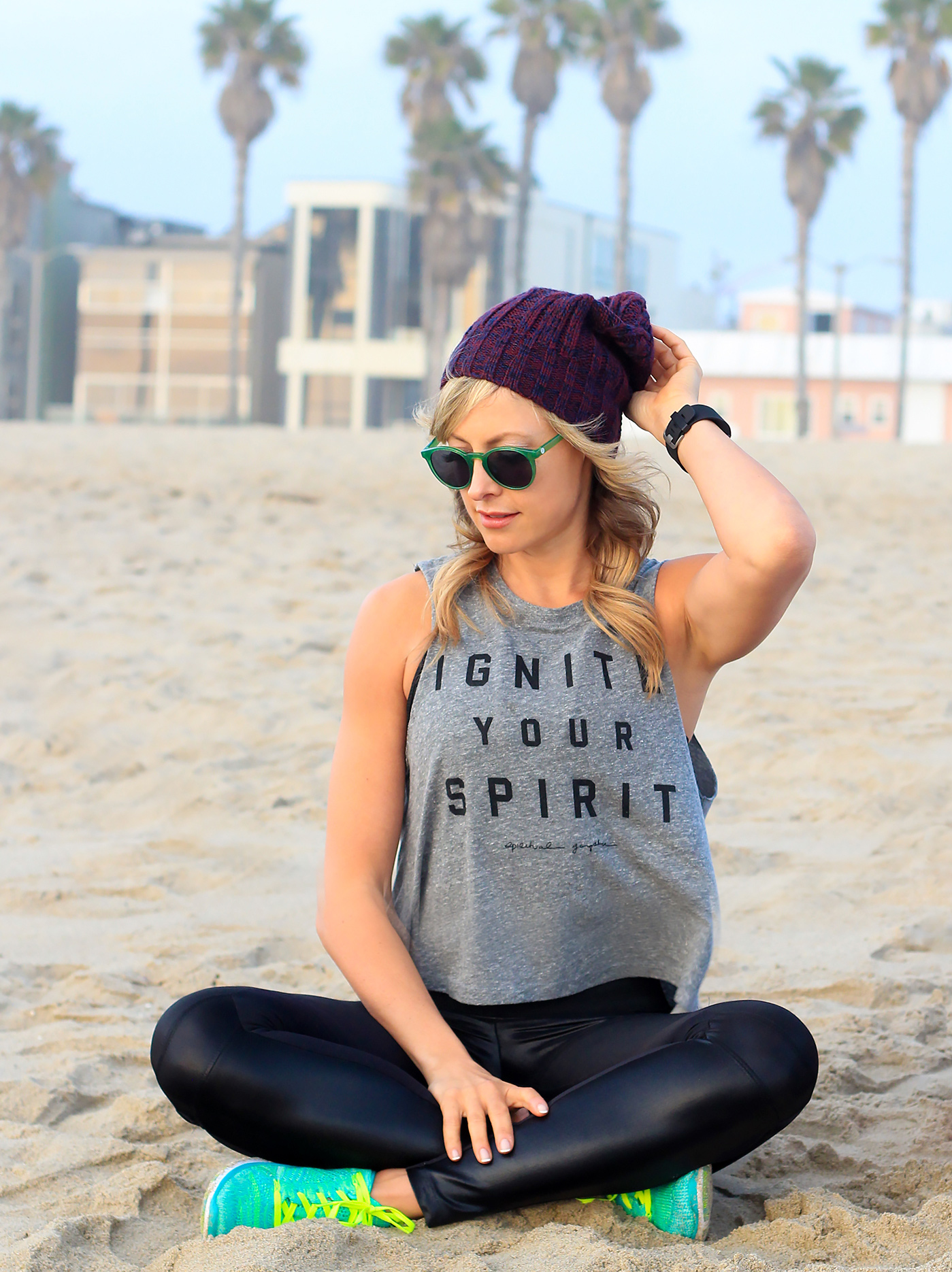
Fitbit Photo Shoot with Elise Joan
Fitbit is hosting free local events each month in Los Angeles led by Elise Joan and Todd McCullough, so Elise and I hit the beach to get some great shots.

SoFar Sounds Poster Design: 01.28
I designed this poster for SoFar Sounds L.A.'s January 28 show. I found this great trendy typeface called Hill House Medium. I love the double bars of the and dots below the O's.
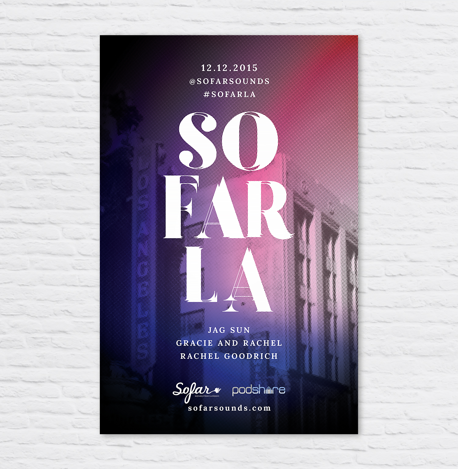
SoFar Sounds Poster Design: 12.12
Here is tonight's poster design for SoFar Sounds Los Angeles. I took this photo while downtown on a shoot this past Tuesday. Fonts used are Lora Bold and Goku Regular.

SoFar Sounds Poster Design: 11.17
I designed this poster for a SoFar Sounds show taking place in Studio City. I found a Studio City image and manipulated it with a color halftone and a purple and blue gradient overlay...
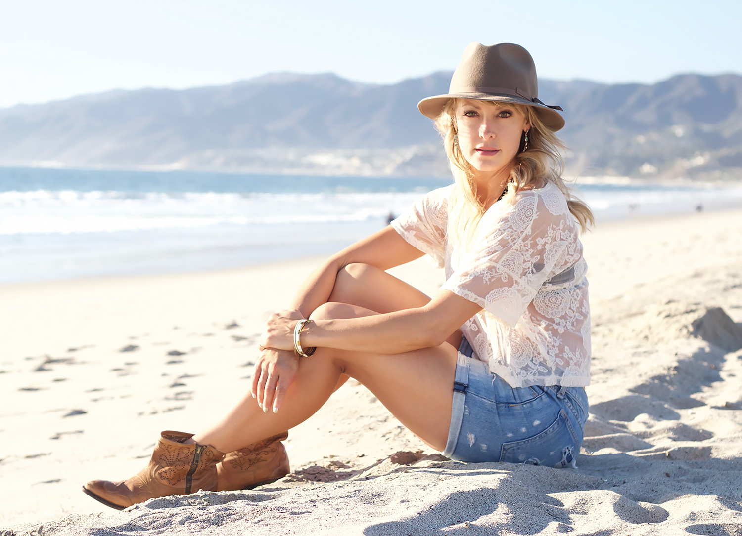
"Baske" in the Sunset
Sunset is my absolute favorite time to take photos. The light falls so softly, making everything feel warm and glowing. Shooting into the direct sun can be difficult, I tend to continually play with the exposure to get some moody lens flares or the perfect silhouette.