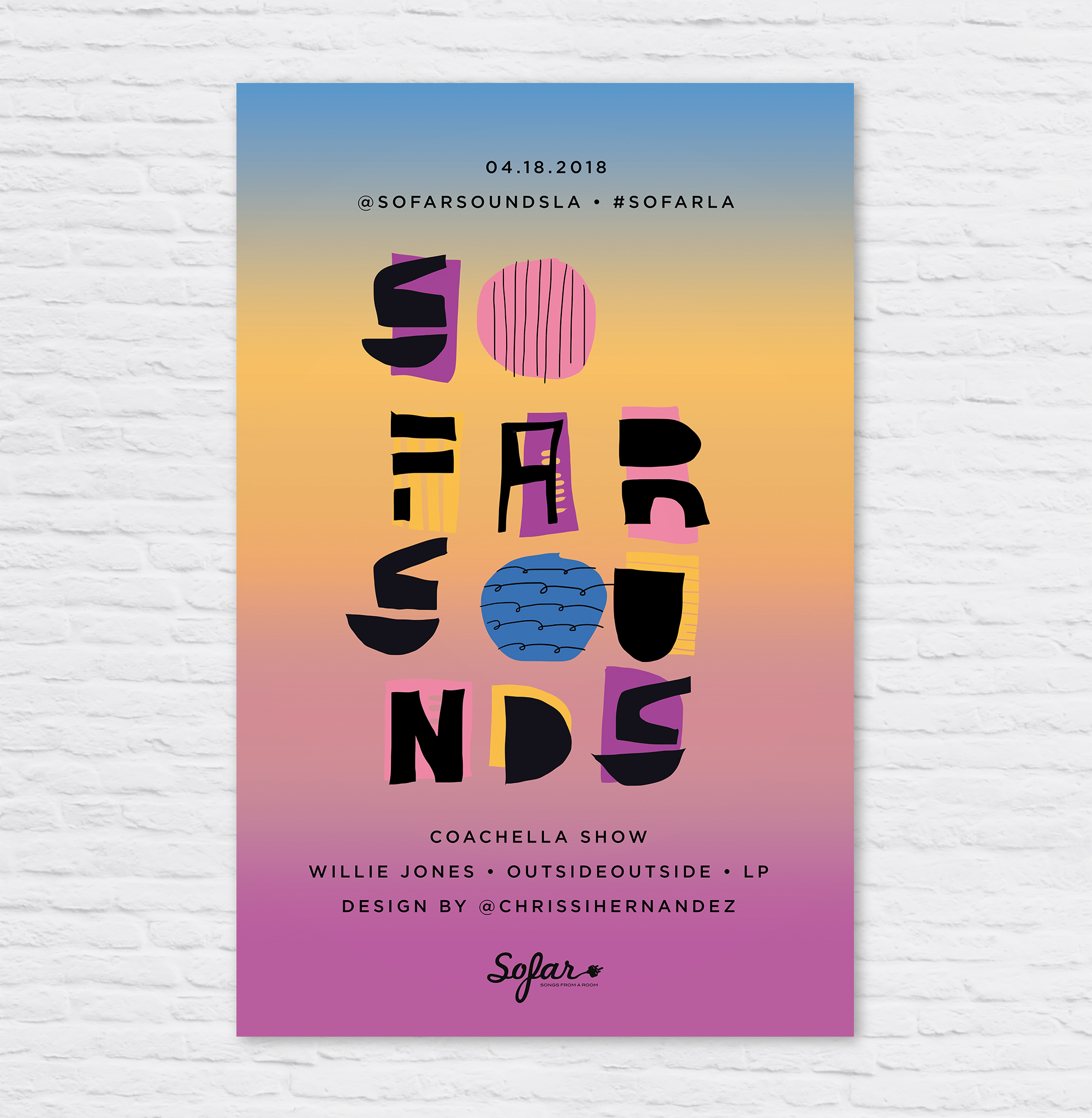
Sofar Sounds Poster Design: 04.18
This Sofar Sounds poster features artists playing Coachella, and are stopping in L.A. to play a show between the two weekends. I drew inspiration from the standard Coachella colors, and a cool Pinterest pin I found with interesting shapes and illustrations. I drew out the shapes in photoshop and layered on the black letters, also drawing these out with the computer in free form.
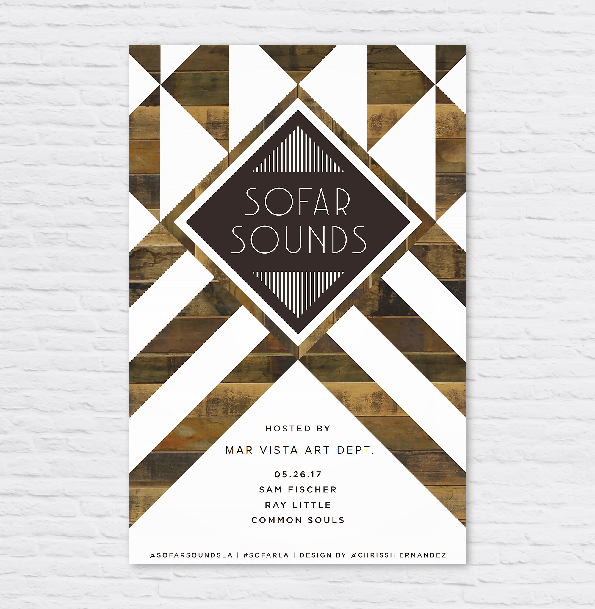
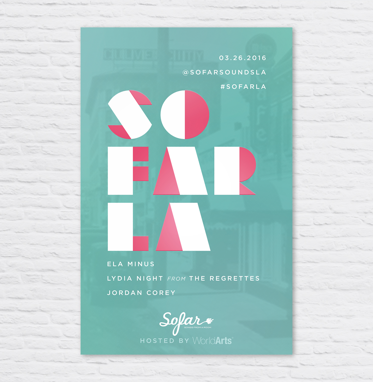
For those who don't know Sofar, they are an amazing company who puts on secret shows in living rooms and offices all over the world. The goal is to create an intimate setting to watch the artists uninterrupted by talking and phone usage, so you can just sit back, BYOB, and enjoy the show!
I had the opportunity recently to collaborate with SoFar Sounds and Amnesty International to create a poster design for their "Give a home" initiative in support of the world's refugees. 1,000 artists, 300 gigs, 60 countries, 1 day.
So Far Sounds L.A. had a show at MV Art Dept in my blossoming neighborhood of Mar Vista. I wanted to mimic the beautifully designed sign as you enter the store. Gorgeous geometric patterns of reclaimed wood, white paint, and steel. I am personally a big fan of MV Art Dept bringing murals and creative workshops to the neighborhood.
I designed this poster for a SoFar Sounds music show taking place in Santa Monica, CA. When I started the design, I wanted to do a play on the letters in SoFar Sounds to create the abbreviation "SAMO" within, short for Santa Monica.
I keep a Pinterest board called "harmonious hues" to keep a log of interesting color combos I'm drawn to. This helps when I'm designing to have some ideas to grab from.
I designed this poster for a SoFar Sounds show taking place in Culver City. I used a vintage image of Culver City, added a color halftone effect and overlaid it onto a seafoam green color.
I designed this poster for a SoFar Sounds show taking place in Culver City. I used an image of a sunset that I took and overlaid it onto a red and purple gradient to give it a moody effect. I used the typeface DecoNeue Light and tweaked in in Illustrator to give it some more character.
I designed this poster for SoFar Sounds L.A.'s January 28 show. I found this great trendy typeface called Hill House Medium. I love the double bars of the and dots below the O's.